UX/ui Designer & developerMade By Bittersweet
The core business challenge for Made By Bittersweet was architectural fragmentation. The brand encompassed three distinct entities—a creative studio, a digital publication (Stories), and a retail shop—which existed as disjointed experiences. Visitors were confused about the brand's identity and where to go to shop or read. My strategic objective was to unify this complex ecosystem into one coherent, e-commerce-enabled digital hub. This required defining a Unified Brand Architecture that clarified the brand’s multiple arms while preserving their individuality, allowing purpose-driven products to be sold in a meaningful, non-transactional way.
Strategic Vision & Design PrinciplesI initiated the strategy with a Content Audit and competitive analysis, which confirmed that fragmented user journeys and weak visual cues were causing confusion.
This led to three strategic design principles that guided the implementation:
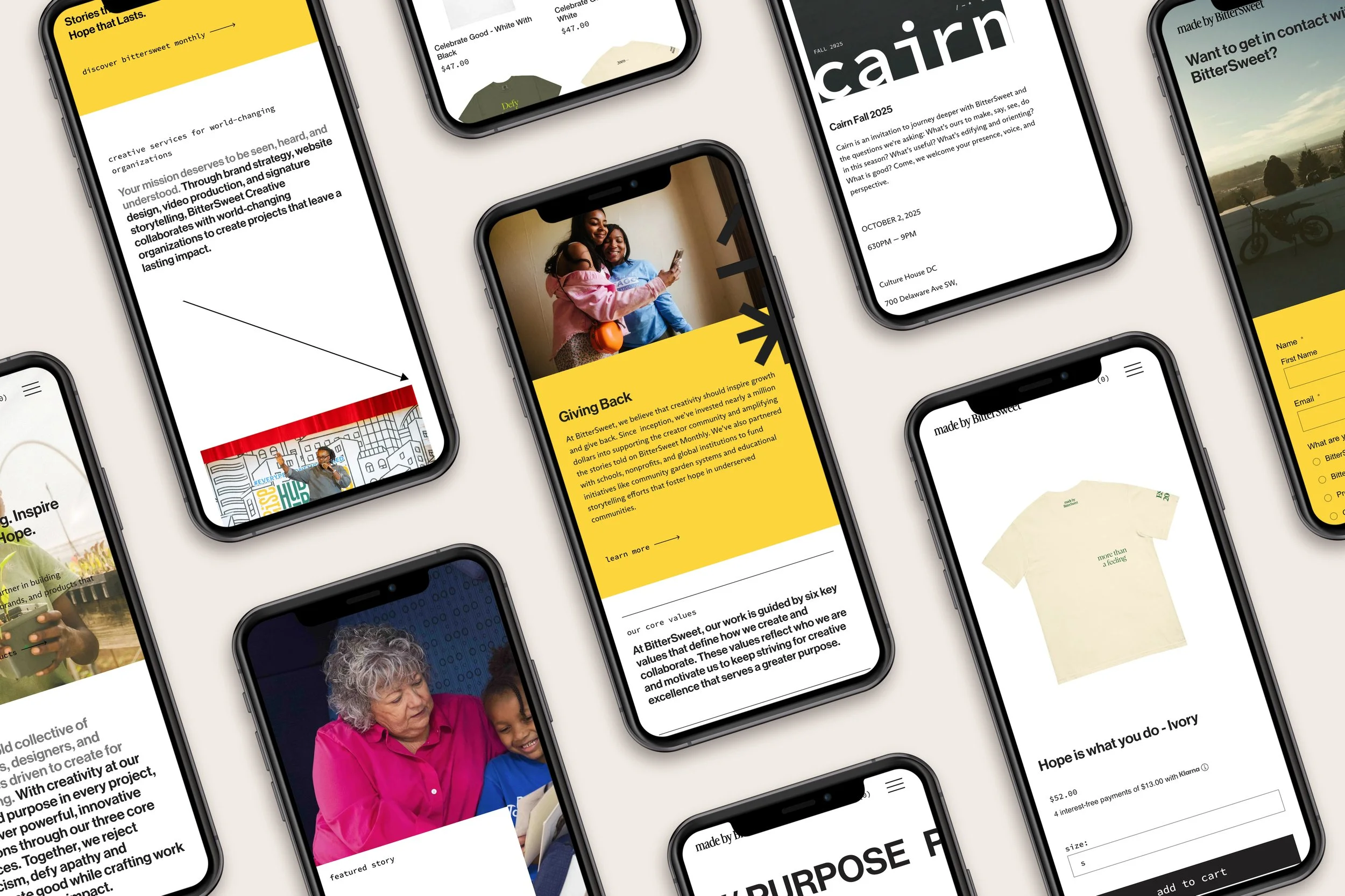
Unified Brand Architecture (one hub, distinct paths)
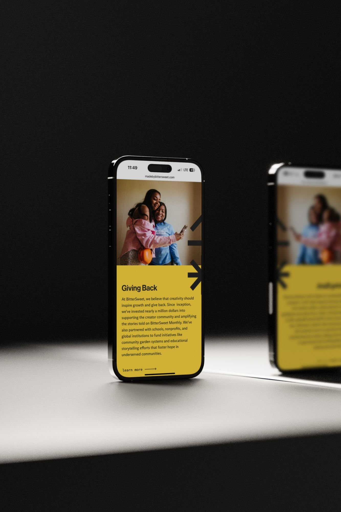
Story-First Shopping (highlighting purpose as product)
Scalable Modular Design (components built to flex across editorial, commerce, and service offerings).
I defined the Information Architecture (IA) and flow to ensure the homepage functioned as an intelligent guidepost, introducing the ecosystem and branching seamlessly into the three core divisions without sacrificing clarity.

UX Leadership & ExecutionGoing Deep
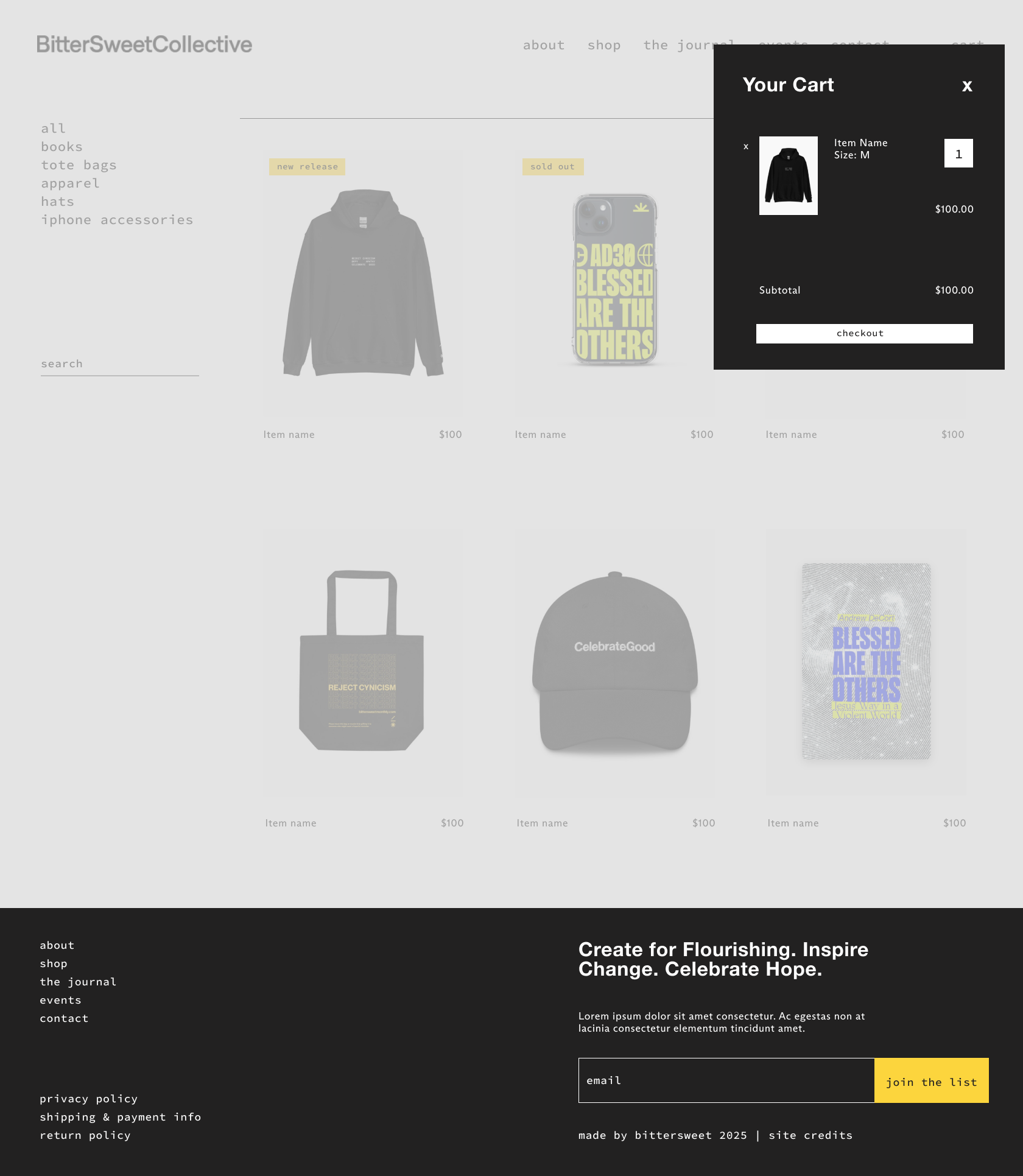
I personally led the definition of the content hierarchy and the Conversion Rate Optimization (CRO) strategy for the shop segment. Working with stakeholders, I ensured the homepage introduced the brand ecosystem at a glance, and each subsequent section was visually and functionally distinct yet cohesive. The Shop portion featured streamlined product displays, minimalist layouts, and clear hierarchy designed to reduce purchase friction. My focus was on establishing a flexible, modular structure that supported immediate sales while ensuring the system could easily accommodate future product lines and editorial features without requiring major redesigns—a critical element for long-term design scalability.
wireframes


Metrics & Quantifiable Impact
The strategic design delivered significant, measurable business results in the first three months, confirming that the redesign not only strengthened brand identity but also drove tangible performance:
Checkout Conversion Rate: Achieved a checkout conversion rate of 4.21%, significantly above the e-commerce industry average for small brands.
Funnel Optimization: Optimized the purchase funnel, resulting in 74% of users who added to cart completing the purchase—a clear indicator of trust and clarity in the buying experience.
Engagement & Retention: Drove 2.3K total visits and 3.8K total pageviews in the first three months, confirming stronger audience retention and deeper content exploration across the three arms (Shop, Studio, and Stories).
Strategic Takeaway: This project demonstrates my ability to lead the design of complex, multi-branch e-commerce systems and achieve strategic business objectives (CRO, funnel optimization) by successfully blending artistic vision and practical application.
What They Said“Really appreciate your interpretation and expression of the BitterSweet vision and ethos! This was an inspiring process for me personally. You handled it all beautifully.”
Key ChallengesBalancing identity and function was the project’s biggest hurdle. The brand’s creative, story-rich identity needed to coexist with practical e-commerce flows and professional service offerings. Without careful design, the site risked feeling either too commercial or too editorial.
Another constraint was scalability: the client wanted a system that allowed new product launches and editorial features without requiring major redesign work each time.
What I LearnedMade By Bittersweet reinforced the importance of designing for identity and system simultaneously. When you build a platform where narrative and commerce live in harmony, you enable a brand to grow intentionally.
This project also reminded me that minimal design is not about removing voice — it’s about giving voice space to be heard. Every visual and interaction must support the brand story, not just the sale.