ux case studyTinyTrade


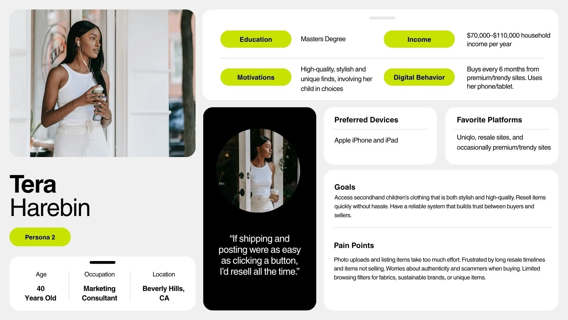
The challenge was to launch TinyTrade, a mobile resale platform, and position it as the simplest, safest, and most trustworthy solution for busy parents. Current resale platforms suffered from friction, especially during the seller's listing process where inconsistent descriptions and complex steps were barriers to entry. My strategic goal was to design an e-commerce experience that felt as seamless as buying new, while embedding trust signals and simplicity into the core Information Architecture. This approach focused on leveraging technology to remove friction and inefficiency from the seller flow, thereby driving mass adoption.
Strategic Vision & Design PrinciplesI began by synthesizing competitive analysis, which confirmed that users needed fewer steps and stronger reassurance.
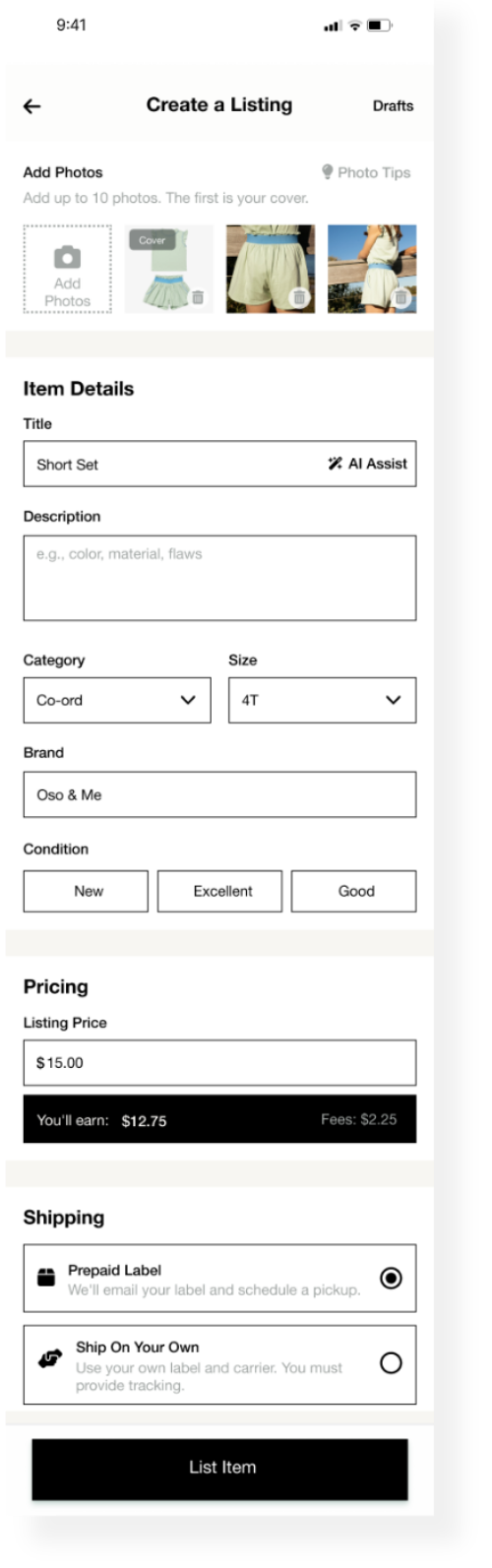
This led to the establishment of four core UX pillars: Simplicity, Speed, Trust, and Accessibility. A key component of the strategy was the decision to integrate AI/Machine Learning functionality to address the friction in the seller flow. Specifically, I defined the product vision to include a feature where AI would assist resellers by generating optimized, accurate product descriptions based on seller-uploaded photos and minimal user input. This move strategically focused on making the resale process intelligent and efficient, eliminating one of the biggest hurdles for sellers.

The solution needed to:
-
01.
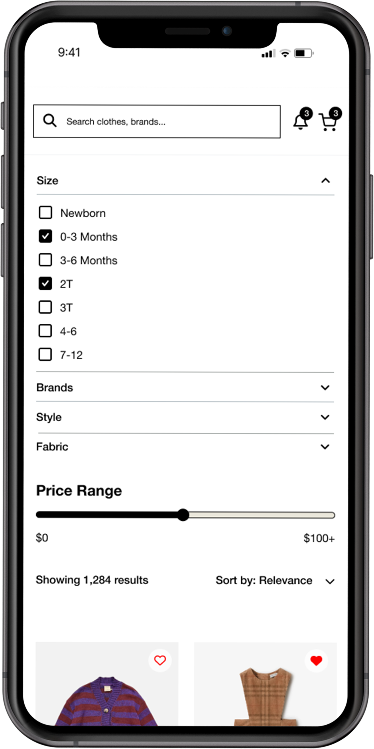
Streamline the listing and checkout process
-
02.
Offer transparent pricing and resale shipping options
-
03.
Build confidence through trust signals and clear communication
-
04.
Keep the interface light, friendly, and easy to navigate for busy parents
UX Leadership & ExecutionGoing Deep
I personally led the end-to-end UX process, translating the user insight and strategic vision into a functional Information Architecture (IA) for a mobile-first platform. My focus was on designing the interaction model for the new AI-Assisted Listing Flow, ensuring the technology felt intuitive and reliable, not complex. Key deliverables included detailed user flows for both Buyer and Seller, with the seller flow specifically detailing the interaction points for AI description approval. I used insights from usability testing to inform necessary iterations, reinforcing the product's focus on intuitive mobile navigation and validating that the technology successfully served the strategic goal of simplifying the complex resale transaction.
Design Approach & ProcessI mapped out user flows and created low-fidelity wireframes focusing on clarity:


lo-fidelity wireframes & Prototype

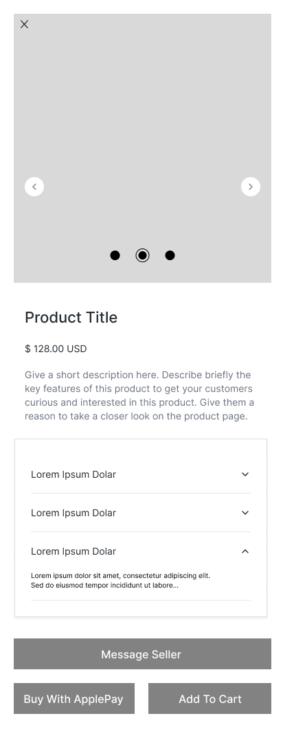
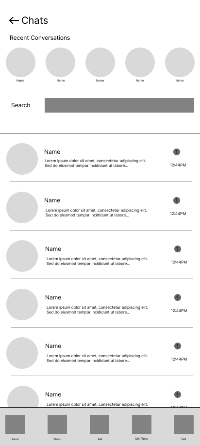

hi-fidelity wireframes


usability testingTesting revealed both friction points and validation moments:
Successes: Users found the process fast and appreciated visual trust cues like “Verified Seller” and estimated delivery times.
Improvements: Some struggled to locate account settings and preferred a clearer way to manage resale hub notifications and accessibility options.

Outcome & Strategic TakeawaysThe outcome is a high-fidelity prototype and design system ready for development, which successfully simplifies the complex peer-to-peer e-commerce model. This project became a strong case study in how strategic technology integration drives business value. By designing a platform that utilizes AI to automate content creation and reduce listing friction, I demonstrated my ability to translate intricate concepts (like logistics and trust) into accessible and highly efficient forms. TinyTrade showcases my full-cycle design expertise and my vision for leveraging intelligent technology to create scalable, outcome-driven solutions.